After some time on the canal, I’m spending this month travelling around in the van, fitting in family events along the way. I’ll be sketching as I go, so will hopefully be posting as I can, or more likely catching up here later in August.
Currently I have work on display still in Northern Ireland until the end of the month, and was really delighted to receive the award of ‘ Highly Commended Whole Submission’ from the Royal Birmingham Society of Artists for all three Fieldwork prints, currently on display as part of the Friends Exhibition at the RBSA gallery in Birmingham until the 16th July.
More about the inspiration and the making of the prints here and here.
My pastel painting ‘the pathless wood’ has been selected for the Weston Park national open art exhibition, showing for the month of August in the Granary Gallery. When I started exhibiting two years ago, this was the first gallery to accept my work. I was very pleased to receive their support then and now, a great confidence-booster and a fabulous exhibition to visit.
My ‘urban reflections’ linoprint is on display in an online exhibition here at ONPAPERCONTEST 2016 as part of the 2nd International ON PAPER printmaking competition, organised by the Barcelona-based artists’ organisation, Sala Ramona.
12 artists have been selected for the final exhibition at Trongate 103 Foyer, Glasgow in August this year. My print did not make the final exhibition, but I am very happy to see it displayed as part of the online exhibition alongside the wonderful work by all the other international participants. On Paper will be showing participants’ work as an online exhibition for a year.
By taking part, I have met some lovely people, I have some international exposure for my own work and can attempt to assess it in relation to the work of others. As well as that I’m now in contact with artists I wouldn’t have found otherwise. I’ll be following up the links to their work and websites.
Applying to exhibitions and competitions can be hit and miss, but is always worthwhile, particularly in the printmaking world where the emphasis is almost always on forging links and providing mutual support as well as honest appraisal.
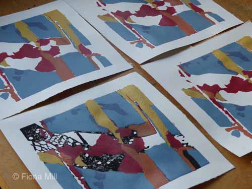
In response to a couple of questions I’ve had about the process, here is some additional info and a couple of slideshows showing the multi-layer printing process I used for the fieldwork prints.
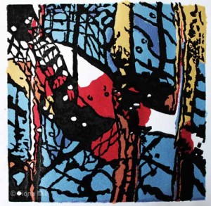
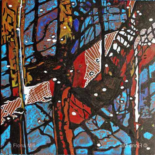
I used the reduction method on linoleum, where you cut away the block between each inking of the colour to reveal the ones beneath. Using this method is not for the faint-hearted… there is no going back! I also cut stencils and masks in the initial layers, wiping and overprinting to create painterly marks in the later layers. I created additional texture by embossing the paper throughout. This isn’t noticeable within the depth of the colour, but adds additional interest on the parts left white.
I used Caligo washable oil-based inks and mixed all the colours including the darkest one from the following: Diarylide Yellow, Napthol Red, Cyan, Raw Umber, Opaque White. (I did not use Black). The paper is a firm and smooth archival 220g from Seawhite of Brighton.
I started with 25 and ended up with a satisfactory edition of 18 for each, plus a random number of the usual chaotic variations (where I printed the wrong plate in the wrong colour on the wrong print, where a stencil changed shape, where I printed upside down, where the paper slipped, where the registration didn’t work out etc).
25 pieces of paper x 6 colours x 3 prints = paper going the press 450 times. Add in the sampling I did in order to check plates and colours + 450 + 30 = 480 times. With the setting-up, cleaning-up and drying time, approx 8 working days. Great fun!
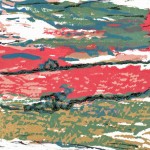
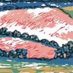
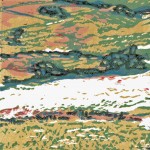
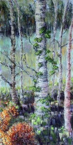
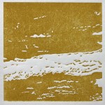
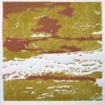
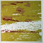
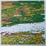
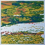
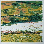
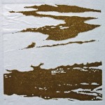
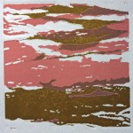
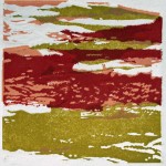
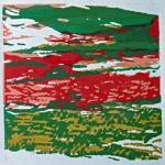
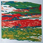
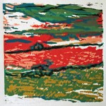
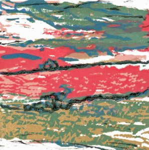
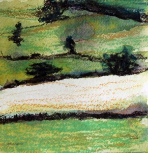
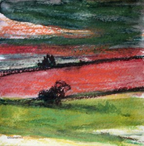
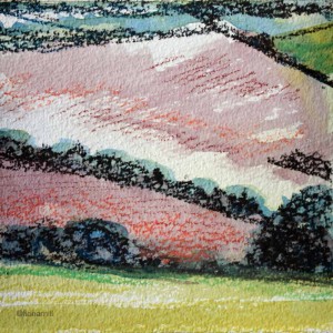
I have just finished these three small reduction linocuts, based on some quick watercolour and pastel sketches I did in Wiltshire last year. The open landscape there is one of rolling downs, long bare ridges dotted with copses of trees (‘hedgehogs’), slow rivers, ancient market towns and stunning neolithic and medieval monuments.
The soil is chalk-based, providing glimmers of white to pewter shining through the crops and grasses; the cloud shadows and sunlight fold across the contours of the land adding subtleties of colour and tone. Endlessly changing but eternal.
I printed them on my much-longed-for, brand-new etching press from gunning arts. There’s no stopping me now.
watercolour and pastel sketch 1watercolour and pastel sketch 2watercolour and pastel sketch 3
Two of the prints have been accepted for the Seacourt International Mini-print Biennial at the Centre for Contemporary Printmaking in Bangor, Co. Down, Northern Ireland, showing from 7th April to 20th May 2016. I hope to get over to see this exhibition, very much looking forward to seeing the work of all the participating artists.
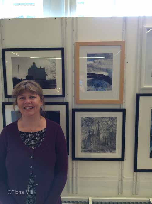
I’ve had two works accepted for the Prize Exhibition at the Royal Birmingham Society of Artists gallery in Birmingham. The exhibition is on show until 13th June. If you’ve never been to the gallery then it’s well worth a visit. There are exhibitions on three floors, with work from artisan designer-makers and fine artists.
I was very pleased to have work accepted for this exhibition.
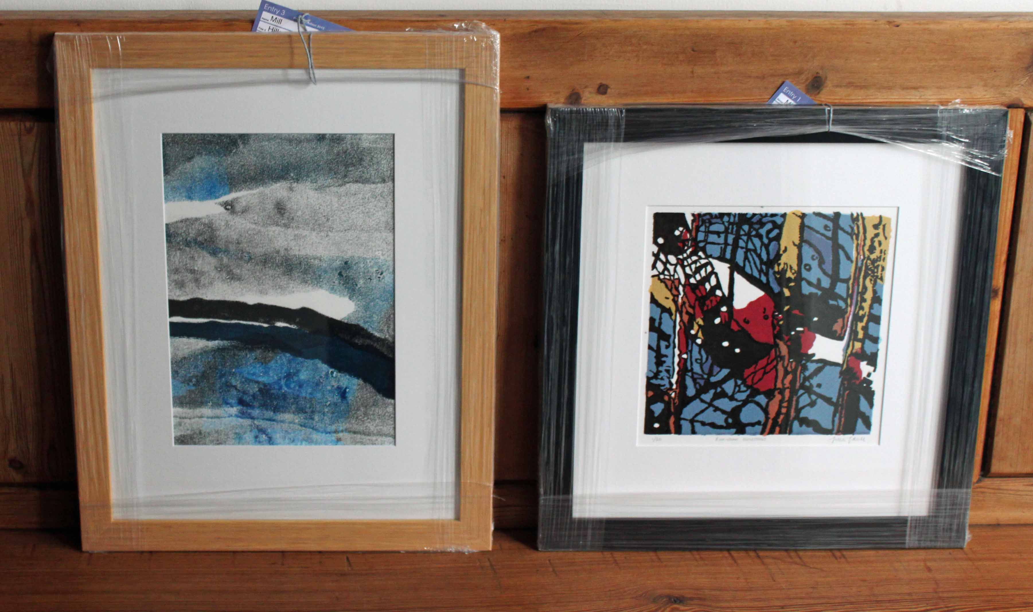
Here are the two works framed and ready to be delivered:
On the right is ‘Birmingham reflections’, relief print, 20cm x 20cm. I talked about this in some detail in my previous post here.
On the left is ‘Hillscape1’, monoprint, 20cm x 30 cm.
When I’m out sketching I alternate styles depending on how I wake up that day. Sometimes I like the challenge and the satisfaction of drawing what’s in front of me, usually in my sketchbook. Other times, inspired by a workshop I attending last year with Lewis Noble, I take a board, A3 paper, charcoal and inks and work loosely trying to capture the landscape around me without spending too much time on the detail. Sometimes I mistake the day and end up in a right mess, other times it works. Comments from passers-by tend to be a bit bemused; ‘well, it’s a start…..’
I have been working on abstracting from these quick field sketches into artist prints and monoprints. Due to the semi-blind nature of the monoprint process, and concentrating on the main elements of the subject and the mark-making, the work mutates into bold images. Some are successful, with life and depth; others are shelved for more development.
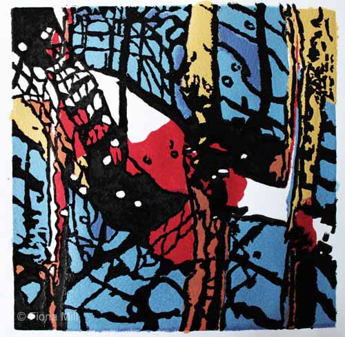
This one has been built up in layers; direct printing using masks, pressure, scratching and blind drawing using black and blue Caligo inks. The original was a sketch done whilst near Dovedale, where the bones of the land are sculpted by running water, and the underlying rock structures seem to bulge, crack and burst through the moorland and grass. There’s a tactile quality to the landscape that lends itself to rough treatment.
Out in Birmingham, sketching and taking photographs along the canals in the city centre, I begin to see the urban topography differently. My younger rock-climbing head is still with me. I map routes in my head up the vertical faces of rocks and buildings. The multi-coloured concrete and glass blocks create deep canyons, balconies and architectural features overhanging older well-trodden walkways and the still canal below. The undercrofts of the new apartment buildings mirror the footprints of the 18th and 19th century wharves and workshops resulting in dark watery cul de sacs protected by metal grills and gates, graffitti here and there, where no hand or boat can possibly reach. But the diverted light reflects off the glass into the water; and the water in turn reflects the prismatic light back onto the buildings. Depths in the surfaces. Dizzying.
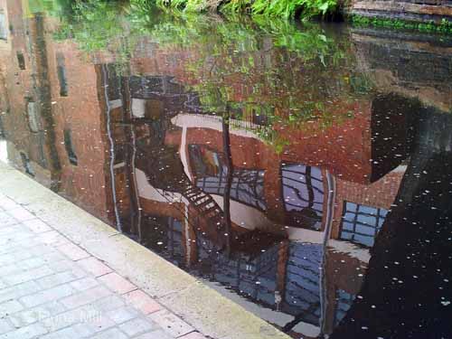
1) A miserable rainy day, but drawn to the reflections, I stop to make a few notes in my sketchbook and take a photo. I realise that I have an idea for a print.
Photo of reflections of some brick buildings and fire escapes on the Birmingham and Fazeley canal in central Birmingham.
2) When I get back I sort through the information I’ve gathered but influenced by the smells, the dampness and the grey day , I decide to work on another print entirely in monochrome.
But the reflections stay with me. A few weeks later I take some lino and draw and paint the image directly onto the block using a pentel brush pen and watercolour. I remember just in time to reverse the image so that it will print true to the orientation of the actual building. This is the first of a series of flips and reversals that tax my brain and patience until something clicks and I finally work out how to simplify and manage all the lines and shapes.
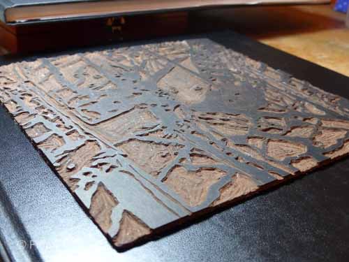
3) I nearly always paint the key image onto the block before carving, but don’t always paint in the colours. For this image though I needed first of all to review the positive and negative shapes and then create a map towards the final result. This photo of the painted block anchors me through the process. It also complicates my initial idea of the colours resulting in a classic printmaker’s muddle all of my own making.
Pentel brush pen, white gel pen and watercolour on lino block.
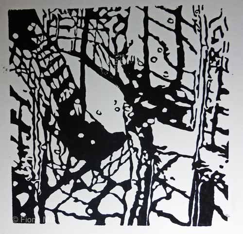
4) I cut away everything on the lino apart from the black.
Key block carved.
5) Using water-based printing inks, I take a print of the block and then adjust the carving and repeat until I’m sure I’ve got what I want. I’m happy with the overall composition and the strength of the image.
Key block printed onto cartridge paper
6) I then turn to carving the colour blocks. I need 5 colours; red, sepia, yellow and two shades of blue. I work out how to do this by layering three primary colours. I’ll have to factor in a lot of drying time, but I think I can meet my deadline.
It’s at this stage I get into a muddle. I carve three blocks making sure to leave a whole corner on each to aid the exact registration of the different blocks. I start to register and hand-print the first colour and leave to dry. When I come to print the second colour a few days later, I realise that although I have left a whole corner on each plate for registration, they are different corners. The abstract nature of the image has confused me. I’m annoyed with myself, but I mark each plate with a large T for ‘top’ and start again.
One of the plates cracks along an edge. I work round it.
The registration is now fine, but the layering of the colours isn’t working well. I’m using water-based inks on 220gsm paper, and for some reason the red and blue inks are repelling each other. I mix the inks with some transparent medium and start again. Better, but not quite right.
I’m burnishing each plate by hand. The process is too long and too complicated. I miss the exhibition deadline. I am tired and a bit disheartened. I decide to stop and leave this one for a while.
7) Some weeks pass. But the strength of the key block and the image has stayed in my mind. I get the unsuccessful prints off the rack and have another look at them. Nothing to salvage here, so I get rid of them.
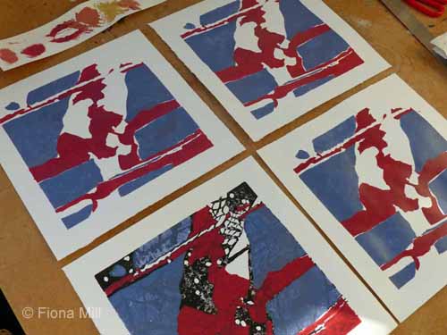
I decide to change strategy. I print the colours using masks and stencils cut from the key block. I print some key blocks and leave to dry, then cut a stencil for each colour. No need to flip the stencils. I make my own inks from a 50:50 combination of acrylic based paint and screenprinting fluid. Drying time is fast so I work quickly. The ink works well, and the colours are true. The shapes look good but I won’t know if it’s successful until I overprint the black key-block.
blue and red
overprinted with pale blue, sepia and yellow
8) I end up experimenting with various types of printing inks in black. There is a slight sheen to the 50/50 home-made ink, probably an acrylic content, so water-based printing ink is repelled. I try washable oil-based ink, but it dries too matt and is not quite right. I’m beginning to run out of coloured screenprints for experimentation.
I decide to use rubber-based printing ink for the black key block. Success. The key-block brings the image together. The line and composition is strong. I am pleased with the image. not so pleased with the cleaning up… rubber-based ink is sticky.
The whole process from start to finish has taken about 6 months. The muddles I got into are not atypical. Printmaking can be a frustrating and unpredictable process. But the idea of the final image stayed with me, and I persisted until I had resolved it. Whether I will print an edition or not… well, I’m not sure at the moment. But I expect I will (after a suitable amount of time has elapsed!)
‘urban reflections’, relief print, 2015, 21 x 21 cm
The annual exhibition of the Dudley Society of Artists is on display until 10th January in the top gallery of Dudley Museum and Art Gallery. I joined the society this year and very much value their quiet, supportive and inclusive approach. A typical weekly meeting includes members drawing a life model, others doing their own thing, a themed display of members’ work along one wall, or the work and sketchbooks of one featured member, and also regular workshops and appraisal evenings. There is a tradition of quiet in the first hour or so of the meeting, relaxing to general chat in the second half. Professional artists are very generous in sharing their experience, newcomers are appreciated and made welcome. No hierarchies and no cliques.
The work on display is well worth a visit. There is opportunity for visitors to vote for a public favourite, and in typical DSA fashion, the prize of £25 does not to go to the artist but instead to one of the people who have voted for them.
My prints are now ready to send to the Sketchbook Project Print Exchange. The exchange involves 500 printmakers across the world. Each will send an edition of 12 prints to the Brooklyn Art Library in New York, where one will be exhibited, another archived and the remaining 10 distributed to 10 of the participating printmakers. I will then receive 10 different prints selected from 10 of the participating printmakers.
It’s a wonderful opportunity to exhibit and also to meet like-minded artists across the world. I’m very much looking forward to the surprise of receiving the 10 prints. It’s very unlikely that I’ll be able to travel to the exhibition but I will hopefully be able to see the photos of the works online.
I’ve been considering the ‘just a second’ theme for a while and decided to interpret it (perhaps rather obviously) as an interpretation of ‘two’ and was exploring various ideas. In the interim various life events have intervened, so I needed a quick decision this week in order to prepare and print the required edition of 12.
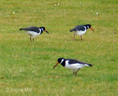
Oystercatchers on Carnoustie golf course, Nov 14
I’ve just been in Angus where these striking birds are found in parks, on golf courses, on traffic islands and rooves as well as in their more natural habitat on rocks and beaches by the sea.
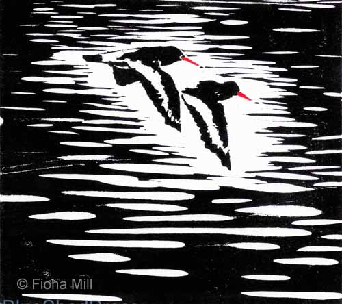
Oystercatchers in flight, carved birch plywood
In flight they fly on point, fast and swooping, a flash of black and white wings with a hint of red on legs and beaks.
Oystercatchers in flight, woodcut, 6″ x 5″
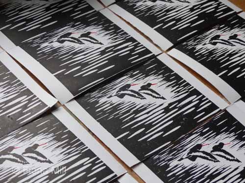
I’ll be sending the submission this weekend. The exhibition will take place in the New Year.
Lately I’ve been looking at my sketchbooks differently. I’m still drawing in sketchbooks, drawing whatever is in front of me at that moment; it’s a great way to try out new media and techniques, and also a way of recording where I’ve been and when, ‘seeing the world one drawing at a time’.
I realised this year though that I’ve got a bit stuck in my sketchbooks, a place of comfort rather than development. We all have our places of comfort, and sketchbook work is mine. But I also enjoy the freedom of working fast and large and would like to do more.
So, I’m now trying a different kind of practice in the field and in the studio. Influenced by a workshop I attended recently in Ashbourne with Lewis Noble, I’ve been taking a drawing board and A3 paper out with some larger brushes.
Working big and fast in inks and gestural marks, unexpected elements of the landscape take prominence on the paper, and new focal points begin to emerge.
Torn out and glued onto a page, the sketch extracts take on a life of their own. I now have a sketchbook full of ideas for further development.
For me, in these pared-down marks, the essence of the landscape is more intense, the mood more expressed, the shape and pattern of the land beneath and the lines and marks made by human intervention more stark and obvious. More truthful to the experience of living and working in it perhaps.
The monoprint above was hand-pressed in multiple layers using printing inks and torn-paper masks.