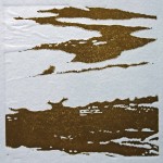
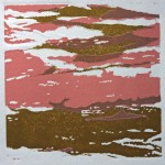
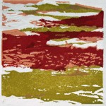
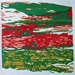
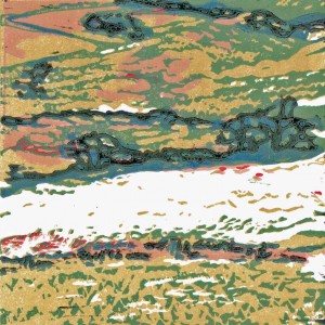
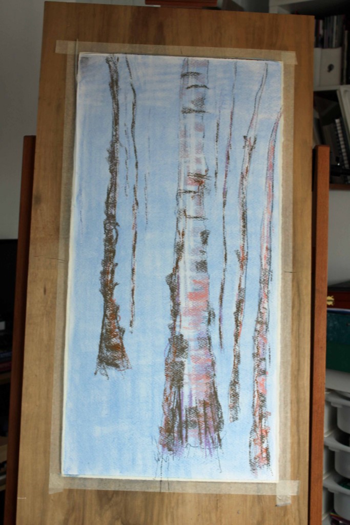
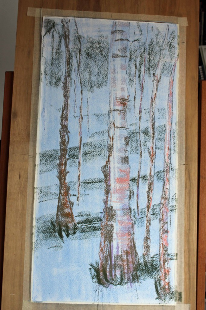
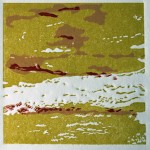
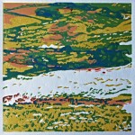
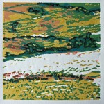
In response to a couple of questions I’ve had about the process, here is some additional info and a couple of slideshows showing the multi-layer printing process I used for the fieldwork prints.
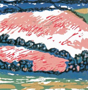
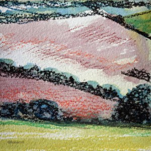
I used the reduction method on linoleum, where you cut away the block between each inking of the colour to reveal the ones beneath. Using this method is not for the faint-hearted… there is no going back! I also cut stencils and masks in the initial layers, wiping and overprinting to create painterly marks in the later layers. I created additional texture by embossing the paper throughout. This isn’t noticeable within the depth of the colour, but adds additional interest on the parts left white.
I used Caligo washable oil-based inks and mixed all the colours including the darkest one from the following: Diarylide Yellow, Napthol Red, Cyan, Raw Umber, Opaque White. (I did not use Black). The paper is a firm and smooth archival 220g from Seawhite of Brighton.
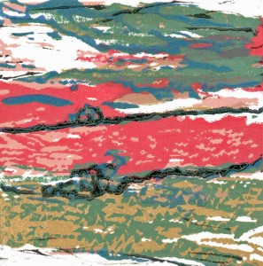
I started with 25 and ended up with a satisfactory edition of 18 for each, plus a random number of the usual chaotic variations (where I printed the wrong plate in the wrong colour on the wrong print, where a stencil changed shape, where I printed upside down, where the paper slipped, where the registration didn’t work out etc).
25 pieces of paper x 6 colours x 3 prints = paper going the press 450 times. Add in the sampling I did in order to check plates and colours + 450 + 30 = 480 times. With the setting-up, cleaning-up and drying time, approx 8 working days. Great fun!
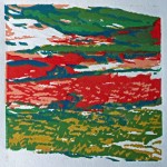
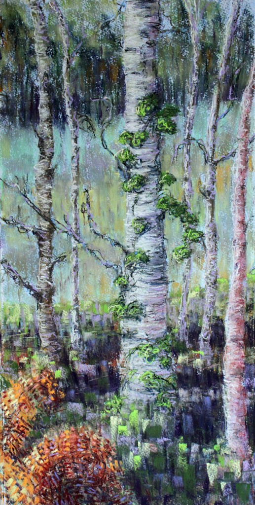
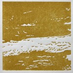
Fieldwork 1
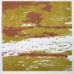
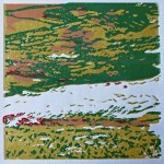
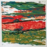
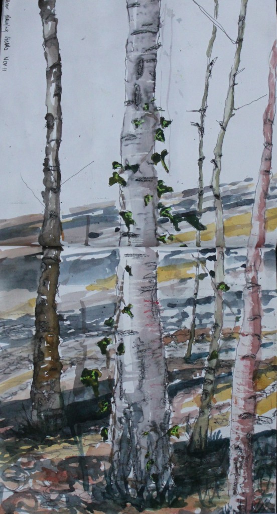
Fieldwork 2